"This project is a typically Dutch interior design assignment: a canal-house renovation.
The apartment HG, located on the Herengracht, is part of a 100-year-old building located on one of Amsterdam’s most beautiful 17th-century canals. Despite the great location, when we first saw it the space wasn't particularly inviting. It had a cold, formal atmosphere, and over the years the organisation had become illogical and confused. Our refit maximized the spatial experience, with materials and detailing the keys to adding warmth, elegance and serenity to this private home. (...)
Approaching the space through the garden, as it were, we discovered a tall and beautiful arched window that was cut in half by a floor going right through the middle of it. We opened up the floor and made the resulting void the space for a sculptural new staircase. Through the now opened-up window, the apartment gained great views of the neighbouring gardens as well as uninterrupted light. The lines of the winding staircase reflect the curving ornamentation of the arched window and the smaller arched openings on either side of it.
Removing the floor added a lofty dimension to the space. We simplified the layout so that the split-level living room and kitchen occupy the uninterrupted space of the ground floor, while the new staircase leads up to the bedroom. On one side of the staircase, a bathroom is separated from the main space by a monumental sliding marble ‘wall’. A dark glass storage room stands in geometric relationship to it on the other side.
While leaving most of the 120m² space open and white, so as to maximize the light and space, we made it a priority to design a few particular, comfortable and generous objects for our client.
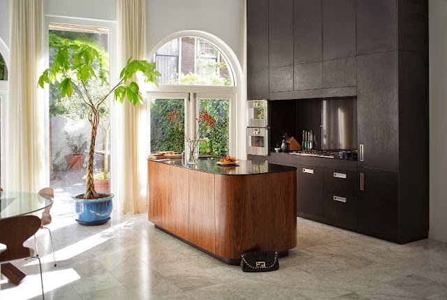
In addition to the emerald-green marble bathroom wall and glass storeroom, we added a range of further elements which share a certain monumentality, expressed in clean, pure materials with clear properties. In the kitchen, which occupies the rear space of the ground floor leading out onto the courtyard, a black, floor-to-ceiling object has a matte, black, papery finish. It houses most of the kitchen cabinets and appliances.
Opposite this, a warm wooden oblong forms a kitchen island for the sink. More wood creates the sculptural niche for the bed in the bedroom upstairs. In the living area, three stairs link the raised area, with its wooden floor, with the lower space, which features an expansive floor-to-ceiling bookshelf. A further set of stairs playfully but practically links the upper level of this bookshelf to the platform of the living area, which is bathed in light reflected from the canal outside."
Via Powerhouse Company | More on The Wall Street Journal


No comments:
Post a Comment
I love to read your comment!